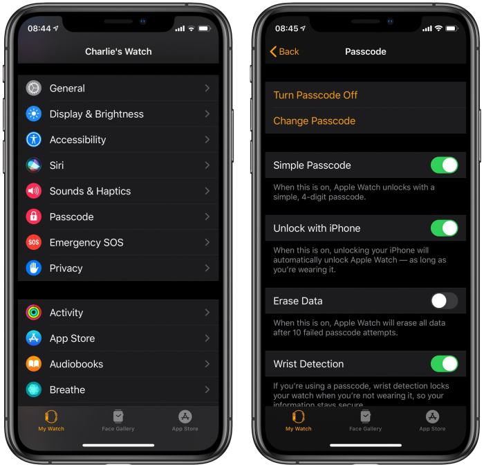
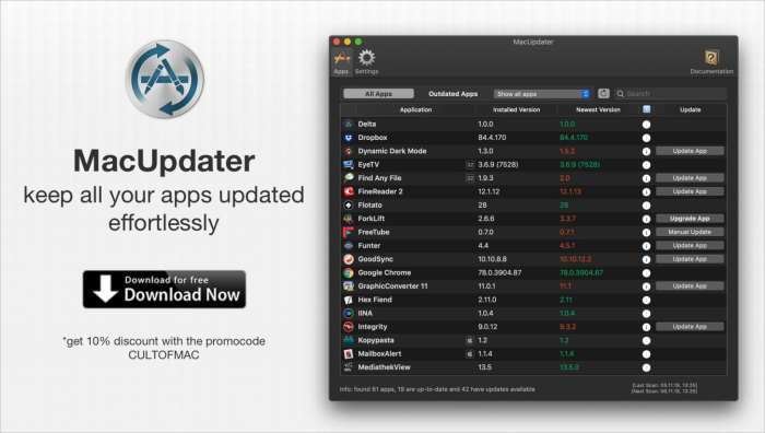
This Simple Command Will Keep Your Mac Apps Bleeding-Edge
This simple command will keep your Mac apps bleeding-edge: Tired of outdated software holding you back? Want to stay ahead of the curve with the latest features and security updates? Well, buckle up, because there’s a simple trick that’ll keep your Mac apps running like a well-oiled machine. We’re talking about automatic updates – a…