
Creating Infographics To Visualize Data For Research Projects
Creating infographics to visualize data for research projects is the process of using visual representations to present data from research projects in a clear and concise way. For example, a researcher may use an infographic to display the results of a survey on consumer behavior, using charts and graphs to illustrate the findings.
Infographics are becoming increasingly popular as a way to communicate research findings, as they can help to make complex data more accessible and easier to understand. They can also be used to engage audiences and promote discussion about research findings.
One of the key historical developments in the field of infographics was the advent of computer graphics. Prior to the development of computers, infographics were created by hand, which was a time-consuming and labor-intensive process. However, with the advent of computers, it became possible to create infographics more quickly and easily. This led to a proliferation of infographics in a wide range of fields, including research.
Creating infographics to visualize data for research projects
Creating infographics to visualize data for research projects is a valuable skill for researchers. Infographics can help to make complex data more accessible and easier to understand, and they can also be used to engage audiences and promote discussion about research findings.
- Clarity
- Conciseness
- Accuracy
- Visual appeal
- Relevance
- Storytelling
- Engagement
- Dissemination
- Impact
- Innovation
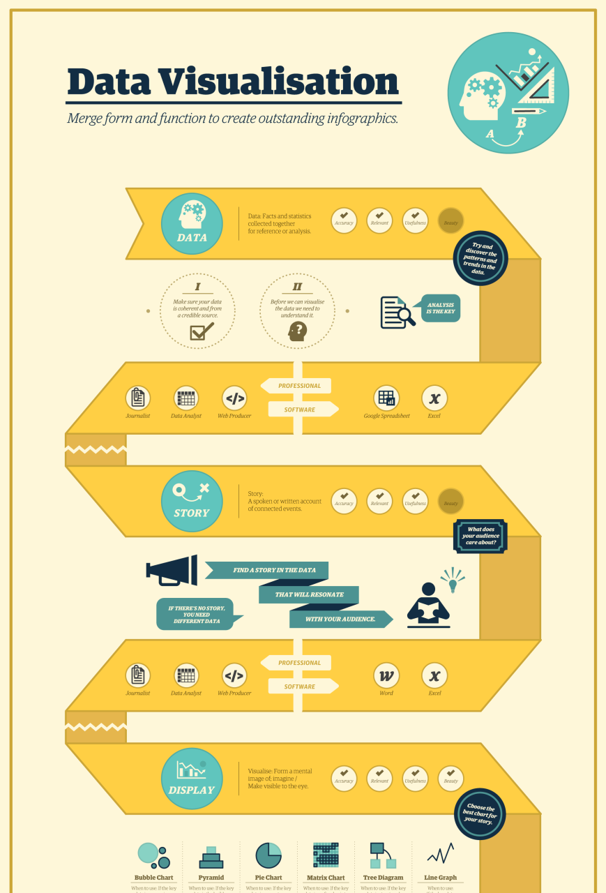
Creating effective infographics requires careful attention to a number of key aspects, including clarity, conciseness, accuracy, visual appeal, relevance, storytelling, engagement, dissemination, impact, and innovation. By following these principles, researchers can create infographics that will effectively communicate their research findings and engage their audiences.
Clarity
Clarity is of paramount importance in creating infographics to visualize data for research projects. An infographic that is not clear will not be effective in communicating its message to the audience. Clarity can be achieved through the use of simple language, concise text, and well-organized visuals.
One of the most important aspects of clarity is the use of simple language. The text in an infographic should be easy to read and understand, even for those who are not familiar with the research topic. Avoid using jargon or technical terms that may be unfamiliar to your audience. Instead, use clear and concise language that is accessible to everyone.
In addition to using simple language, it is also important to keep the text in an infographic concise. Avoid overloading your infographic with too much text, as this can make it difficult to read and understand. Instead, focus on the most important points and present them in a clear and concise way.
Finally, it is important to use well-organized visuals in your infographic. The visuals should be clear and easy to understand, and they should help to illustrate the data in a meaningful way. Avoid using visuals that are cluttered or difficult to read. Instead, use visuals that are simple and easy to understand.
By following these tips, you can create infographics that are clear and easy to understand. This will help to ensure that your audience can easily access and understand your research findings.
Conciseness
Conciseness is another critical component of creating effective infographics to visualize data for research projects. An infographic that is concise will be easier to read and understand, and it will be more likely to hold the audience’s attention. Conciseness can be achieved through the use of clear and concise language, as well as the careful selection of visuals.
One of the most important aspects of conciseness is the use of clear and concise language. The text in an infographic should be easy to read and understand, even for those who are not familiar with the research topic. Avoid using jargon or technical terms that may be unfamiliar to your audience. Instead, use clear and concise language that is accessible to everyone.
In addition to using clear and concise language, it is also important to carefully select the visuals that you use in your infographic. The visuals should be clear and easy to understand, and they should help to illustrate the data in a meaningful way. Avoid using visuals that are cluttered or difficult to read. Instead, use visuals that are simple and easy to understand.
By following these tips, you can create infographics that are concise and easy to understand. This will help to ensure that your audience can easily access and understand your research findings.
Accuracy
Accuracy is of paramount importance in creating infographics to visualize data for research projects. Inaccurate data can lead to misleading or even dangerous conclusions. For example, an infographic that inaccurately represents the results of a medical study could lead to patients making incorrect decisions about their health care.
There are a number of factors that can contribute to inaccuracy in infographics. One common factor is the use of biased data. Biased data is data that has been collected or selected in a way that favors one particular outcome. For example, a survey that only includes respondents who are members of a particular political party is likely to produce biased results.
Another common factor that can contribute to inaccuracy in infographics is the use of misleading visuals. Misleading visuals are visuals that are designed to deceive the viewer. For example, a bar chart that uses a distorted scale to make one data point appear larger than it actually is is misleading. Avoid using biased data and misleading visuals, carefully check your data for errors, and be transparent about your data sources and methods.
By following these tips, you can create accurate infographics that will effectively communicate your research findings. Accurate infographics can help to inform decision-making, promote understanding, and improve the quality of public discourse.
Visual appeal
Visual appeal is a critical component of creating effective infographics to visualize data for research projects. Infographics that are visually appealing are more likely to capture the attention of the audience and to be shared and discussed. They can also help to make complex data more accessible and easier to understand.
There are a number of factors that contribute to the visual appeal of an infographic. These include the use of color, typography, and imagery. Color can be used to create a sense of hierarchy and to draw attention to important elements of the infographic. Typography can be used to create a visually appealing and easy-to-read infographic. Imagery can be used to illustrate data and to make the infographic more engaging.
Real-life examples of visual appeal in infographics include the use of bright colors to highlight key findings, the use of clear and concise typography to make the text easy to read, and the use of relevant and engaging imagery to illustrate the data.
The practical applications of this understanding are vast. Infographics with strong visual appeal are more likely to be used by journalists, bloggers, and other influencers to communicate research findings to a wider audience. They are also more likely to be shared on social media and other online platforms.
Relevance
Relevance is a critical component of creating effective infographics to visualize data for research projects. An infographic that is not relevant to the audience will not be effective in communicating its message. Relevance can be achieved by ensuring that the infographic is focused on a specific topic and that the data presented is relevant to that topic.
One way to ensure that an infographic is relevant is to start by identifying the target audience. Once the target audience has been identified, the researcher can tailor the infographic to meet the needs of that audience. For example, an infographic that is designed for a lay audience will need to use clear and concise language, while an infographic that is designed for aaudience may use more technical language.
In addition to identifying the target audience, it is also important to consider the purpose of the infographic. What do you want the audience to learn from the infographic? Once you know the purpose of the infographic, you can select data that is relevant to that purpose.
By following these tips, you can create infographics that are relevant to your audience and that effectively communicate your research findings.
Storytelling
Storytelling is an essential aspect of creating effective infographics to visualize data for research projects. By using storytelling techniques, researchers can make their infographics more engaging, memorable, and persuasive.
-
Narrative structure
Infographics should have a clear narrative structure, with a beginning, middle, and end. The beginning should introduce the topic and the data, the middle should present the findings, and the end should summarize the key points and draw conclusions.
-
Characters and conflict
Infographics can use characters and conflict to create a more engaging story. For example, an infographic about the impact of climate change could feature a character who is affected by rising sea levels.
-
Emotional appeal
Infographics can use emotional appeal to connect with the audience on a deeper level. For example, an infographic about the benefits of exercise could use images of people who have improved their health through exercise.
-
Call to action
Infographics can end with a call to action, encouraging the audience to take a specific action. For example, an infographic about the importance of voting could end with a call to action to register to vote.
By using storytelling techniques, researchers can create infographics that are more likely to be read, remembered, and shared. Storytelling can help researchers to communicate their findings in a clear, concise, and engaging way.
Engagement
Engagement is a critical component of creating effective infographics to visualize data for research projects. When people are engaged with an infographic, they are more likely to read it, understand it, and share it with others.
There are a number of factors that can contribute to engagement, including the use of clear and concise language, visually appealing design, and interactive elements. Infographics that are visually appealing are more likely to capture the attention of the audience, while interactive elements can help to keep the audience engaged and interested.
For example, an infographic about the benefits of exercise could include interactive elements that allow the user to track their own progress or compare their progress to others. This type of interactivity can help to keep the audience engaged and motivated to learn more about the topic.
Dissemination
Dissemination is an essential aspect of creating infographics to visualize data for research projects. It is the process of sharing infographics with a wider audience, which can help to raise awareness of the research findings and promote discussion and engagement.
-
Online sharing
Infographics can be easily shared online through social media, email, and other platforms. This allows researchers to reach a wider audience and promote their findings to people who may not be familiar with their research.
-
Print distribution
Infographics can also be printed and distributed in print publications, such as newspapers, magazines, and newsletters. This can help to reach a wider audience and promote the research findings to people who may not be online.
-
Presentations
Infographics can be used in presentations to communicate research findings to a live audience. This can be an effective way to engage with the audience and promote discussion about the research findings.
-
Workshops and training
Infographics can be used in workshops and training sessions to teach others about the research findings. This can be an effective way to disseminate the research findings and promote their use in practice.
Dissemination is an important part of the research process. It allows researchers to share their findings with a wider audience, promote discussion and engagement, and make a meaningful impact on the world.
Impact
The impact of creating infographics to visualize data for research projects can be significant. Infographics can help to communicate complex research findings in a clear and concise way, making them more accessible to a wider audience. This can lead to increased understanding of the research, as well as greater engagement with the research findings.
For example, a study by the Pew Research Center found that infographics are more likely to be read and shared than text-based content. This suggests that infographics can be an effective way to reach a wider audience and promote discussion about research findings.
In addition to increasing understanding and engagement, infographics can also have a positive impact on the research process itself. By visualizing data, researchers can identify patterns and trends that may not be apparent from the raw data. This can lead to new insights and discoveries, which can further advance the research.
Overall, creating infographics to visualize data for research projects can have a significant impact on the research process and its outcomes. Infographics can help to communicate research findings more effectively, increase understanding and engagement, and lead to new insights and discoveries.
Innovation
Innovation is a key aspect of creating infographics to visualize data for research projects. It involves the use of new and creative approaches to present data in a visually appealing and informative way. Innovation can take many forms, from the development of new visualization techniques to the use of interactive elements.
-
Novel Visualization Techniques
One of the most important aspects of innovation in infographics is the development of new visualization techniques. These techniques can help to make data more accessible and easier to understand. For example, a researcher might use a 3D visualization to represent complex data in a way that is easy to grasp.
-
Interactive Elements
Another way to innovate in infographics is to use interactive elements. These elements allow users to interact with the infographic and explore the data in more depth. For example, a researcher might use a slider to allow users to see how data changes over time.
-
Data Storytelling
Innovation in infographics can also involve the use of data storytelling. Data storytelling is the art of using data to tell a compelling story. By using data storytelling techniques, researchers can make their infographics more engaging and memorable.
-
User Experience (UX) Design
Finally, innovation in infographics can also involve the use of user experience (UX) design principles. UX design principles can help to make infographics more user-friendly and accessible. For example, a researcher might use a simple and intuitive design to make their infographic easy to navigate.
Innovation is essential for creating infographics that are visually appealing, informative, and engaging. By using innovative approaches, researchers can create infographics that effectively communicate their research findings and make a lasting impact.
FAQs on Creating Infographics to Visualize Data for Research Projects
This section provides answers to frequently asked questions about creating infographics to visualize data for research projects. These questions address common concerns, misconceptions, and practical considerations to help you create impactful and informative infographics.
Question 1: What are the key elements of an effective infographic?
Answer: Effective infographics typically include a clear title, concise text, relevant data visualizations, and a visually appealing design. They should also be easy to understand and shareable.
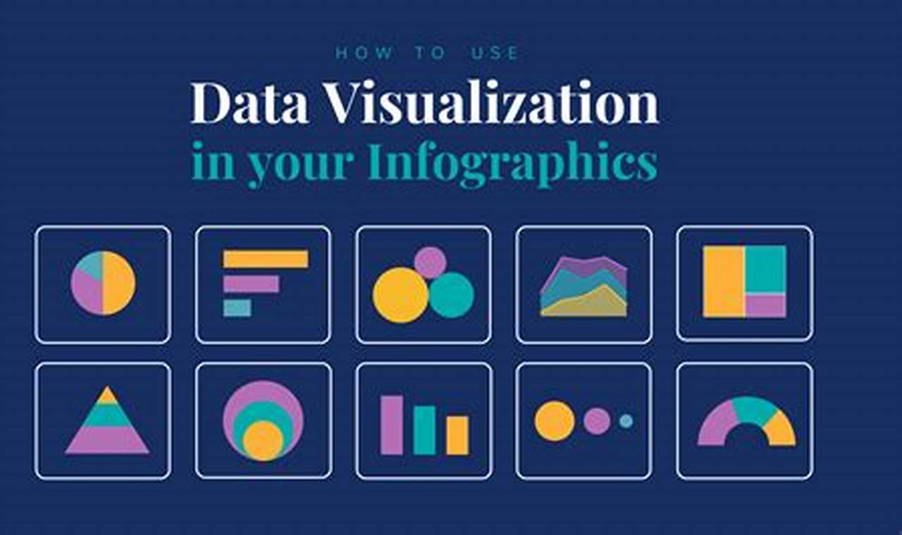
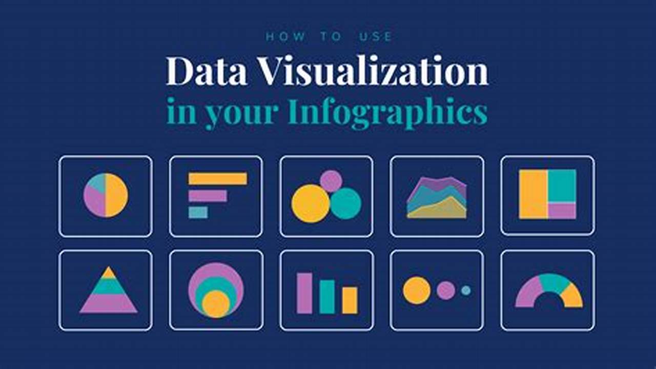
Question 2: What are some best practices for choosing data visualizations?
Answer: When selecting data visualizations, consider the type of data you have, the purpose of your infographic, and your audience’s understanding of the subject matter. Different visualizations are suitable for different types of data and communication goals.
Question 3: How can I make my infographics more engaging?
Answer: To enhance engagement, use a variety of visual elements such as color, images, and interactive features. Consider storytelling techniques to present your data in a compelling and memorable way.
Question 4: What are the common mistakes to avoid when creating infographics?
Answer: Avoid cluttering your infographics with too much text or data. Use clear and concise language, and ensure your visualizations are accurate and easy to interpret. Additionally, pay attention to color choices and design aesthetics to enhance readability and visual appeal.
Question 5: How can I ensure the accuracy of my infographics?
Answer: Verify the accuracy of your data from credible sources and double-check your calculations and visualizations. Cite your sources and provide context to support your claims.
Question 6: What are some tools and resources available for creating infographics?
Answer: Various online and offline tools can assist you in creating infographics. Explore options like Canva, Piktochart, and Venngage. Additionally, refer to design principles and best practices to enhance the visual effectiveness of your infographics.
Summary: These FAQs provide a foundation for understanding the key aspects of creating infographics for research projects. By considering these guidelines, you can create impactful and informative infographics that effectively convey your research findings.
Transition: In the next section, we will delve deeper into the benefits of using infographics in research communication and explore strategies for effectively integrating them into your research dissemination efforts.
Tips for Creating Infographics to Visualize Data for Research Projects
This section provides practical tips to help you effectively create infographics that visually represent your research data. By following these tips, you can enhance the clarity, impact, and accessibility of your research findings.
Tip 1: Define Your Purpose and Audience
Clearly define the intended message and target audience for your infographic. This will guide your design and content choices.
Tip 2: Select Appropriate Data Visualizations
Choose data visualizations that best represent your data and align with your communication goals. Consider bar charts, pie charts, line graphs, or other suitable options.
Tip 3: Use a Clear and Concise Design
Prioritize simplicity and readability. Use a clean layout, legible fonts, and a limited color palette to ensure your infographic is visually appealing and easy to understand.
Tip 4: Include Supporting Text and Context
Provide brief, explanatory text to guide your audience through your infographic. Add context and insights to provide a deeper understanding of your data.
Tip 5: Ensure Accuracy and Credibility
Verify the accuracy of your data and cite sources to establish credibility. Use reputable data sources and double-check your calculations.
Tip 6: Consider Interactivity and Engagement
Explore interactive elements to enhance engagement. Use features like clickable sections, hover effects, or sliders to allow users to explore your data in more detail.
Tip 7: Optimize for Sharing and Accessibility
Design your infographic for easy sharing on various platforms. Use high-resolution images and consider accessibility features like alt text and closed captions for videos.
Summary: By incorporating these tips into your infographic creation process, you can create visually impactful and informative materials that effectively communicate your research findings, engage your audience, and promote wider dissemination.
Transition: In the final section, we will discuss strategies for integrating infographics into your research dissemination efforts, maximizing their impact, and promoting broader engagement with your research.
Conclusion
Creating infographics to visualize data for research projects is a powerful technique that enhances communication, engagement, and the impact of research findings. By following best practices in infographic design, researchers can effectively convey complex data in a visually appealing and accessible manner.
Key points to consider include defining the purpose and audience, selecting appropriate data visualizations, ensuring accuracy and credibility, using clear and concise design, and optimizing for sharing and accessibility. Infographics can be integrated into presentations, publications, social media, and websites to disseminate research findings, engage broader audiences, and stimulate discussion and collaboration.


![[Tutorial] How to clean your PC from dust. PC dust cleanup tutorial](https://boticasoft.com/wp-content/uploads/2024/03/maxresdefault-54-768x432.jpg)