

Building A Responsive Website With Bootstrap A Beginner Friendly Guide
Building a responsive website with Bootstrap: A guide for beginners
A responsive website is a website that can automatically adjust its layout and content to fit the size of the screen it is being viewed on. This is important because it ensures that your website is accessible and easy to use on all devices, from desktop computers to smartphones. Bootstrap is a popular front-end framework that makes it easy to create responsive websites. It provides a set of pre-built CSS styles and JavaScript plugins that you can use to create your own website.
In this article, we will provide a step-by-step guide on how to build a responsive website with Bootstrap. We will cover the basics of responsive design, how to use Bootstrap to create a responsive website, and some tips for making your website look its best on all devices.
Building a responsive website with Bootstrap
In today’s digital world, it is essential to have a website that is responsive, meaning it can be viewed and used on any device, from a desktop computer to a smartphone. Bootstrap is a popular front-end framework that makes it easy to create responsive websites. In this guide, we will provide a step-by-step guide on how to build a responsive website with Bootstrap, covering the following key aspects:
- Getting started with Bootstrap
- Creating a basic layout
- Adding content
- Styling your website
- Making your website responsive
- Adding interactivity
- Debugging your website
- Publishing your website
By following this guide, you will learn how to create a responsive website that is both visually appealing and easy to use. We will provide you with step-by-step instructions, as well as code examples, to help you get started. Whether you are a beginner or an experienced web developer, this guide will help you create a responsive website that meets your needs.
Getting started with Bootstrap
Getting started with Bootstrap is the first step in building a responsive website with Bootstrap. Bootstrap is a popular front-end framework that makes it easy to create responsive websites. It provides a set of pre-built CSS styles and JavaScript plugins that you can use to create your own website.
-
Installing Bootstrap
The first step is to install Bootstrap. You can do this by downloading the Bootstrap files from the Bootstrap website or by using a package manager like npm or Bower. -
Creating a new project
Once you have installed Bootstrap, you can create a new project. To do this, create a new directory for your project and then create a new HTML file in the directory. -
Linking Bootstrap to your HTML file
The next step is to link Bootstrap to your HTML file. You can do this by adding the following line to the head of your HTML file:
<link rel="stylesheet" href="css/bootstrap.min.css"> Starting to build your website
Now you can start building your website. Bootstrap provides a set of pre-built components that you can use to create your own website. These components include things like navigation bars, buttons, and forms.
Getting started with Bootstrap is easy. By following these steps, you can quickly and easily create a responsive website that looks great on all devices.
Creating a basic layout
Creating a basic layout is the first step in building any website. A basic layout defines the overall structure of your website, including the header, footer, and main content area. When creating a basic layout for a responsive website, it is important to use a fluid grid system. A fluid grid system allows your website to adapt to different screen sizes.
-
Header
The header is the topmost part of your website. It typically contains your website’s logo, navigation menu, and other important information. -
Footer
The footer is the bottommost part of your website. It typically contains copyright information, contact information, and other important links. -
Main content area
The main content area is the central part of your website. It contains the main content of your website, such as blog posts, articles, or products. -
Sidebar
A sidebar is a vertical column that is located on the side of the main content area. It typically contains additional information, such as related articles, social media links, or advertisements.
Creating a basic layout is an important step in building a responsive website. By using a fluid grid system and following the tips above, you can create a website that looks great on all devices.
Adding content
Adding content is a crucial aspect of building a responsive website with Bootstrap. Content is what makes your website unique and informative, and it is what will attract and engage visitors. When adding content to your website, it is important to keep in mind the following:
- Use clear and concise language. Your visitors should be able to easily understand your content, so avoid using jargon or technical terms that they may not be familiar with.
- Use images and videos to break up your text. Visuals can help to make your content more engaging and easier to read.
- Use headings and subheadings to structure your content. This will help your visitors to quickly scan your content and find the information they are looking for.
- Use a consistent style throughout your website. This will help your website to look professional and cohesive.
By following these tips, you can add content to your website that is both informative and engaging. This will help you to attract and retain visitors, and it will also help you to achieve your website goals.
Styling your website
Styling your website is an essential part of building a responsive website with Bootstrap. The way your website looks and feels will have a big impact on how users interact with it. A well-styled website will be easy to navigate, visually appealing, and consistent with your brand identity.
Bootstrap provides a number of tools to help you style your website. These include:
- CSS classes: Bootstrap comes with a large number of pre-built CSS classes that you can use to style your website. These classes cover everything from typography to layout to buttons.
- Sass variables: Bootstrap also provides a number of Sass variables that you can use to customize the look and feel of your website. These variables can be used to change things like the colors, fonts, and sizes of your website.
- JavaScript plugins: Bootstrap also provides a number of JavaScript plugins that you can use to add interactivity to your website. These plugins can be used to create things like carousels, modals, and tooltips.
By using Bootstrap’s styling tools, you can create a website that is both visually appealing and easy to use. This will help you to attract and retain visitors, and it will also help you to achieve your website goals.
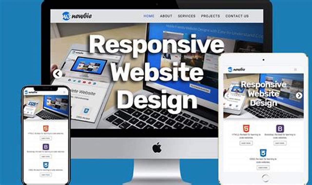
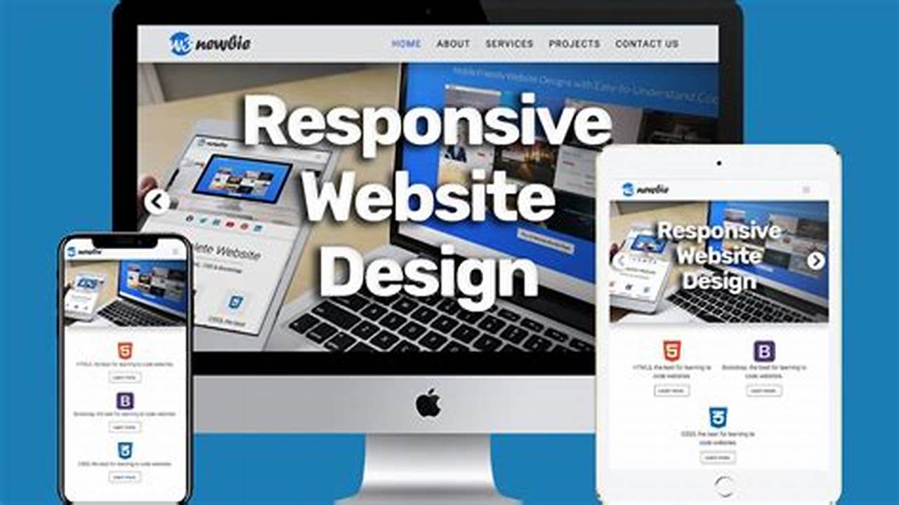
Making your website responsive
Making your website responsive is an essential part of building a responsive website with Bootstrap. A responsive website is one that can adapt to different screen sizes, ensuring that it is easy to view and use on any device. Bootstrap provides a number of tools and features to help you make your website responsive, including a fluid grid system, responsive images, and media queries.
There are a number of benefits to making your website responsive. First, it can help you to reach a wider audience. With more and more people using their smartphones and tablets to access the internet, it is important to make sure that your website is accessible to them. Second, a responsive website can help you to improve your search engine ranking. Google and other search engines give preference to websites that are responsive, so making your website responsive can help you to attract more visitors.
There are a number of real-life examples of websites that have benefited from making their website responsive. For example, the website of the New York Times was redesigned in 2012 to be responsive. This redesign resulted in a significant increase in traffic from mobile devices. Another example is the website of the BBC, which was redesigned in 2013 to be responsive. This redesign resulted in a 25% increase in traffic from mobile devices.
Making your website responsive is a relatively simple process, and it can have a significant impact on your website’s success. By using Bootstrap’s tools and features, you can easily make your website responsive and reach a wider audience.
Adding interactivity
Adding interactivity to your website is a great way to make it more engaging and user-friendly. Bootstrap provides a number of tools and features that you can use to add interactivity to your website, including JavaScript plugins, CSS animations, and media queries.
One of the most popular ways to add interactivity to your website is to use JavaScript plugins. Bootstrap provides a number of pre-built JavaScript plugins that you can use to add things like carousels, modals, and tooltips to your website. These plugins are easy to use and can help you to create a more dynamic and engaging user experience.
Another way to add interactivity to your website is to use CSS animations. CSS animations can be used to create a variety of effects, such as fading in and out elements, rotating elements, and sliding elements. CSS animations are relatively easy to implement and can help you to create a more visually appealing website.
Finally, you can also use media queries to add interactivity to your website. Media queries allow you to change the appearance and behavior of your website depending on the size of the screen. This is useful for creating responsive websites that look and work well on all devices.
Adding interactivity to your website can be a great way to improve the user experience and make your website more engaging. By using Bootstrap’s tools and features, you can easily add interactivity to your website and take it to the next level.
Debugging your website
Debugging your website is an essential part of building a responsive website with Bootstrap, or with any other web development framework. Debugging is the process of finding and fixing errors in your code. Errors can cause your website to behave unexpectedly, or even crash completely. Debugging can be a time-consuming and frustrating process, but it is essential to ensure that your website is working properly.
There are a number of tools and techniques that you can use to debug your website. One common technique is to use the console in your browser. The console allows you to view error messages and other information about your website as it is loading. You can also use a debugger, such as the Chrome Developer Tools, to step through your code line by line and identify any errors.
Debugging your website can be a complex and challenging task, but it is essential to ensure that your website is working properly. By using the right tools and techniques, you can quickly and easily identify and fix errors in your code, and ensure that your website is running smoothly.
Publishing your website
Publishing your website is the final step in building a responsive website with Bootstrap. Once you have created your website, you need to publish it so that it can be viewed by the world. There are a few different ways to publish your website, but the most common way is to use a web hosting provider.
A web hosting provider is a company that provides space on their servers for you to store your website files. When you publish your website, you are essentially uploading your website files to your web hosting provider’s servers. Once your website files are uploaded, your website will be live and accessible to anyone with an internet connection.
Publishing your website is a critical component of building a responsive website with Bootstrap. Without publishing your website, no one will be able to see it. By publishing your website, you are making it available to the world and allowing people to interact with your content.
FAQs on Building a Responsive Website with Bootstrap
This FAQ section addresses common questions and misconceptions surrounding the topic of “building a responsive website with Bootstrap.” It provides clear and concise answers to help beginners understand the key aspects and best practices involved in creating responsive websites using Bootstrap.
Question 1: What is Bootstrap and why should I use it for responsive web design?
Answer: Bootstrap is a popular front-end framework that provides a collection of pre-built CSS styles and JavaScript components. It simplifies the process of creating responsive websites by offering a consistent and mobile-first approach. By leveraging Bootstrap, developers can save time and effort while ensuring their websites adapt seamlessly to different screen sizes and devices.
Question 2: What are the key benefits of using Bootstrap for responsive web design?
Answer: Bootstrap offers several advantages for responsive web design, including:
- Simplified Development: Bootstrap’s pre-built components and styles streamline the development process, reducing the time and effort required to create responsive websites.
- Consistent Design: Bootstrap ensures a consistent design across all devices, providing a seamless user experience regardless of the screen size or platform.
- Mobile-First Approach: Bootstrap prioritizes mobile devices, ensuring that websites display optimally on smaller screens and adapt gracefully to larger ones.
Question 3: How do I get started with Bootstrap for responsive web design?
Answer: Getting started with Bootstrap is straightforward. You can include Bootstrap’s CSS and JavaScript files in your project, or use a package manager like npm or Bower. Bootstrap provides comprehensive documentation and tutorials to guide you through the setup and usage.
Question 4: What are some best practices for using Bootstrap in responsive web design?
Answer: To optimize your use of Bootstrap for responsive web design, consider the following best practices:
- Use a fluid grid system to ensure your layout adapts to different screen sizes.
- Leverage media queries to target specific devices or screen resolutions.
- Optimize images for fast loading and responsive display.
- Test your website across multiple devices and browsers to ensure it renders correctly.
Question 5: Where can I find additional resources and support for building responsive websites with Bootstrap?
Answer: Bootstrap provides extensive documentation, tutorials, and a vibrant community forum. You can also find numerous online courses, articles, and examples to help you learn and build responsive websites with Bootstrap.
Question 6: What are some common challenges or pitfalls to watch out for when using Bootstrap for responsive web design?
Answer: While Bootstrap simplifies responsive web design, there are some challenges to be aware of:
- Over-reliance on Bootstrap: Avoid relying solely on Bootstrap’s components without customizing them to fit your specific design requirements.
- Cross-browser compatibility: Ensure your website functions correctly across different browsers and devices by testing thoroughly.
- Performance optimization: Consider optimizing your website’s performance by minifying CSS and JavaScript files, and using caching techniques.
These FAQs provide a comprehensive overview of the key aspects, benefits, and best practices involved in building responsive websites with Bootstrap. By leveraging Bootstrap’s features and adhering to these guidelines, you can create websites that adapt seamlessly to different devices and provide a great user experience across all platforms.
In the next section, we will delve deeper into the technical aspects of responsive web design with Bootstrap, exploring advanced techniques and strategies for creating dynamic and engaging websites.
Tips for Building a Responsive Website with Bootstrap
This section provides practical tips to help beginners create responsive websites using Bootstrap. By following these tips, you can enhance the user experience, improve accessibility, and ensure your website adapts seamlessly to different screen sizes and devices.
Tip 1: Utilize the Fluid Grid System
Bootstrap’s fluid grid system allows elements to resize and adapt to the available space. This ensures your website’s layout remains consistent and visually appealing across all devices.
Tip 2: Implement Media Queries
Media queries enable you to target specific screen sizes or resolutions. By using media queries, you can customize the appearance and behavior of your website based on the device being used.
Tip 3: Optimize Images for Responsiveness
Images can significantly impact website loading time and responsiveness. Use responsive image techniques, such as setting the image’s max-width to 100%, to ensure images scale proportionally and adapt to different screen sizes.
Tip 4: Test Responsiveness Thoroughly
Thoroughly test your website’s responsiveness across multiple devices, browsers, and screen resolutions. This helps identify and address any display issues or inconsistencies.
Tip 5: Leverage Bootstrap’s Components
Bootstrap provides a wide range of pre-built components, such as navigation bars, buttons, and forms. These components are designed to be responsive and can save you time while ensuring a consistent user experience.
Tip 6: Customize Styles for Different Devices
While Bootstrap offers default styles, you can customize the appearance of your website for specific devices. Use media queries to apply custom styles to different screen sizes, ensuring your website aligns with your brand identity.
Tip 7: Consider Accessibility
Ensure your responsive website is accessible to users with disabilities. Use proper heading hierarchy, provide alternative text for images, and design for keyboard navigation to enhance usability.
Tip 8: Monitor and Iterate
Continuously monitor your website’s performance and user feedback. Make necessary adjustments and improvements to enhance the user experience and adapt to evolving device trends.
These tips empower you to create responsive websites that deliver a seamless experience across devices. By implementing these practices, you can improve your website’s accessibility, usability, and overall user engagement.
In the next section, we will explore advanced techniques and strategies for building dynamic and feature-rich responsive websites with Bootstrap, taking your web development skills to the next level.
Conclusion
In this comprehensive guide, we have delved into the intricacies of building responsive websites with Bootstrap, empowering beginners with the knowledge and techniques to create dynamic and user-friendly websites. Throughout our exploration, several key ideas have emerged:
- The Importance of Responsive Design: In today’s digital landscape, it is essential to build websites that adapt seamlessly to different devices and screen sizes. Responsive design ensures accessibility and enhances the user experience across various platforms.
- The Benefits of Bootstrap: Bootstrap provides a robust framework for responsive web development, offering pre-built components, a fluid grid system, and mobile-first approach. By leveraging Bootstrap, developers can streamline the development process and create consistent, visually appealing websites.
- Best Practices for Responsive Web Design: To achieve optimal responsiveness, it is crucial to utilize media queries, optimize images, test thoroughly, and consider accessibility. By adhering to these best practices, developers can ensure their websites deliver a seamless experience on all devices.
The ability to build responsive websites with Bootstrap is a valuable skill for web developers. Whether you are just starting out or looking to enhance your existing skills, this guide provides a solid foundation for creating websites that adapt gracefully to the ever-changing digital environment. Embrace the power of responsive design and Bootstrap, and empower your users with a seamless and engaging online experience.


 Reach us on WhatsApp